
Key Takeaways: Office Space Utilization Analytics in 2026
Utilization rate measures actual occupancy divided by total capacity, European offices average 46% across the week and 71% on the busiest day.
Booking data alone overstates usage by 20–35% because of no-shows and ghost bookings, so sensor data or check-in confirmation is essential.
Weekly patterns matter more than averages, with Tuesday through Thursday hitting 85–95% capacity while Monday and Friday drop to 20–30%.
Yoffix analytics help you track occupancy, no-show rates, and utilization trends to identify underused space and optimize your hybrid office.
Organizations that act on utilization data typically reduce real estate costs by 30–50%, generating thousands in savings per desk per year.
Why Office Space Utilization Analytics Matter for Hybrid Workplaces
A financial services firm we worked with was confident their office ran at 70% utilization. Sensor data put the real figure at 44%. That gap between perception and reality is where most real estate overspend lives.
Hybrid work has made tracking utilization data non-optional. When attendance was predictable, static planning worked. Now attendance varies by design, and organizations that still plan space against peak headcount systematically over-provision. According to CBRE's 2026 Global Workplace & Occupancy Insights, office utilization reached 53% (up from 38% in 2024 and 35% in 2023), and 80% of respondents prioritize portfolio optimization.
The question is not whether you have enough space today, but how much you will need across the next lease cycle.
What Is Office Space Utilization and How Is It Measured?
Utilization rate equals the number of spaces in active use divided by total available spaces, multiplied by 100. A 200-desk office with an average of 90 desks occupied shows 45% utilization.
This sounds simple. In practice, most organizations measure it wrong.
The Difference Between Occupancy and Utilization
Occupancy is a point-in-time headcount. Utilization is a time-weighted ratio that compares actual use to available capacity over hours, days, or weeks.
A 100-desk floor with 60 people present at 2 PM shows 60% occupancy at that moment. If those same desks were used by an average of 50 people across the full 8-hour workday, utilization is 50%. One number is operational. The other is strategic.
Why Booking Data Alone Doesn't Work
Treating "booked" as equivalent to "used" is the calculation error that distorts utilization metrics across most organizations. No-shows and ghost bookings inflate apparent utilization by 20–35%. A reserved desk registers as occupied in booking logs whether or not anyone sits there.
That's why Yoffix includes check-in confirmation and auto-release of unused spaces. When someone doesn't check in within a defined window, the desk is automatically released for others to book. This closes the gap between booking intent and actual presence.
Booking data becomes reliable when two conditions hold: most people actually use the system, and check-in is enforced. Adoption is the part teams underestimate. If a third of your employees never book, your logs describe a different office than the one you have. Around 90% of employees use Yoffix at customer sites, which is what turns the booking layer into a measurement layer instead of a rough signal.
The Five Core Metrics You Should Track
Tracking only average utilization is where most real estate decisions go wrong. You need five metrics for a complete picture.
1. Average Utilization Rate
The baseline efficiency figure: total occupied hours divided by total available hours. It sets the floor for portfolio decisions but masks significant day-to-day variance.
2. Peak Utilization Rate
The capacity ceiling. This is the highest recorded occupancy across a defined period and drives decisions about maximum desk counts, meeting room supply, and building services.
3. Weekly Space Utilization Patterns
In hybrid offices, Tuesday through Thursday routinely hit 85–95% of capacity, while Monday and Friday drop to 20–30%. That asymmetry is the core design challenge, not the average.
An office running at 50% average utilization sounds manageable, until Tuesday arrives and every desk is taken by 9 a.m. The midweek surge creates a real capacity problem that headline figures hide entirely.
4. Long-Term Utilization Trends
Quarter-over-quarter and year-over-year shifts signal whether a portfolio is contracting or expanding. These trends inform lease renewal decisions and consolidation timing.
5. No-Show Rates and Ghost Bookings
Tracking the gap between reservations and actual check-ins reveals how much your booking data overstates real demand. Yoffix analytics include no-show reporting so you can see exactly where this gap exists and take action with check-in enforcement policies.
How to Calculate Utilization Rate Step by Step
The core formula is: Utilization Rate (%) = (Spaces in use during observed periods ÷ Total available spaces) × 100.
Both average and peak utilization serve different planning purposes. Average tells you baseline demand. Peak tells you the maximum capacity you must provision for to avoid a crunch on your busiest days. Using only the average risks under-provisioning. Using only the peak wastes space the rest of the week.
Worked Example
Take a 200-desk office observed across a standard 40-hour work week. If sensors record an average of 90 desks occupied at any given hour, the average utilization rate is 45%. If the busiest single hour shows 160 desks occupied, peak utilization hits 80%.
Planning against the 80% peak means provisioning for a demand level that only happens occasionally. Planning against the 45% average risks running out of desks every Tuesday.
How Long Should You Measure?
A single week of observation is insufficient for reliable numbers. Day-of-week patterns usually become clear after 4 to 6 weeks, which is enough to adjust cleaning schedules or desk ratios on a single floor. Decisions about leases and floor consolidation need 8 to 12 weeks across different seasons, so that holidays and quarter-end cycles sit inside the sample rather than distorting it.
Data Collection Methods Ranked by Accuracy
Collection method determines data quality. Four main approaches exist, ranked from lowest to highest fidelity.
Badge and Access-Control Data (Low Fidelity)
Records building entry and exit but cannot tell you which desk, floor, or room an employee used after badging in. Better than nothing, but limited for space-level decisions.
It still has a job as a supporting layer, confirming who was in the building on days when booking numbers look implausibly low. Yoffix takes badge and WiFi signals as optional inputs alongside bookings and check-ins.
Desk Booking Software Logs (Medium Fidelity)
Captures reservations but suffers from the no-show problem. Useful as a directional signal, not a definitive count, unless paired with check-in confirmation.
Passive IoT and Occupancy Sensors (High Fidelity)
Motion or heat sensors mounted under desks or in rooms detect actual presence in near real time, independent of whether a booking was made. Yoffix integrates with occupancy sensors to feed real-time presence data directly into your analytics dashboard.
Computer Vision and People Counters (Highest Fidelity)
Camera-based systems count individuals entering zones and can distinguish between a desk being sat at versus a bag placed on a chair. They produce the most granular data available at scale but require careful privacy handling.
Measuring space without monitoring people
Every method above raises the same question with your works council and your data protection officer, and the answer lies in how the data is reported rather than how it is collected. Utilization analytics only need aggregated figures: how many desks on the third floor were used on Tuesday, not who sat at them. Reports that are anonymized by default, with a minimum group size before any number is shown, satisfy both GDPR and works council requirements. Yoffix works this way and hosts its data in the EU, so utilization data supports space planning without turning into a performance record.
Industry Benchmarks: What's a Good Utilization Rate?
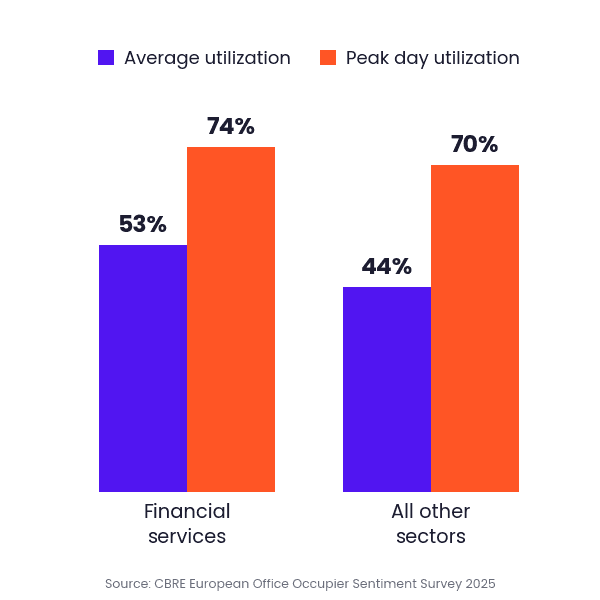
"Good" depends on sector and on how much attendance your policy actually delivers. CBRE's European Office Occupier Sentiment Survey 2025 puts typical weekly average utilization at 46%, and 71% on the busiest day. By sector:
Financial services: 53% average, 74% on peak days
All other sectors: 44% average, 70% on peak days
Technology, media and telecoms: 69% on peak days, up from 61% a year earlier
Financial services runs the tightest offices in Europe and has the widest policy gap: 61% of firms want three or more days in the office, and only 32% of employees come in that often.
Desk supply follows the same pattern. According to JLL's 2026 Global Occupancy Benchmark Report, regional sharing ratios run between 1.2 and 1.5 employees per desk, with EMEA at the low end at 1.2. That works out to roughly 83 desks for every 100 employees in Europe.
Compare average against average and peak against peak, since the two carry different targets. JLL puts the target organizations are working toward at 74%, against 56% measured globally. Yoffix customers reach over 70% office utilization, which is at the level workplace teams actually target and well above that global average.
How to Turn Analytics into Better Planning Decisions
Utilization data is only valuable if you act on it. Three areas deserve attention.
Right-Size Your Office Design
Unused office space is one of the easiest ways to waste money. If desk usage is consistently low in certain areas, consider converting that space into collaboration zones or phone booths.
Perhaps meeting rooms are being used by individuals for calls more often than large team meetings. This indicates a need for more focus rooms and fewer large conference rooms.
Establish the Right Policies
Some of the most impactful changes come from policies, not redesign. Companies with hybrid models often see peaks on certain days. By establishing policies that stagger when different teams come in, you can find more balanced utilization.
Yoffix supports team scheduling that shows each employee which teammates are planning to come in and when. This visibility helps teams coordinate office days around actual collaboration needs rather than arbitrary schedules.
Enforce Booking Accountability
If no-show rates are high, implement check-in requirements with automatic release. Yoffix allows you to set check-in windows and auto-release rules so desks don't sit empty when someone forgets to cancel.
How Yoffix Analytics Help You Optimize Space
Yoffix delivers real-time occupancy analytics and AI-powered optimization suggestions designed specifically for hybrid workplaces. The platform tracks:
Desk utilization: See which desks and zones are most and least used
Room booking efficiency: Compare booked time versus actual usage
No-show rates: Identify where ghost bookings inflate your numbers
Attendance patterns: Understand daily and weekly variation across teams
Team coordination: See how often teams successfully align their office days
Yoffix integrates natively with Microsoft Teams and Outlook, and also syncs with Google Workspace and Slack, so employees book and check in from the tools they already have open. That removes the friction that normally erodes adoption, and adoption is what makes the data worth reading.
Common Mistakes to Avoid
Three patterns undermine most utilization tracking efforts.
Relying on Badge Data Alone
Badge data tells you someone entered the building. It doesn't tell you which floor they worked on, how long they stayed, or whether they actually used a desk. Layer sensor data or booking check-ins on top.
Ignoring Weekly Variance
Average utilization masks the Tuesday crunch. If you plan against the average, you'll run out of space on peak days. If you plan against the peak, you'll overpay for empty desks on Fridays.
Measuring for a Single Week
Short measurement windows miss seasonal patterns, holiday effects, and quarter-end cycles. Plan for 8–12 weeks of data collection before making portfolio decisions.
Getting Started with Utilization Analytics
Start with an audit of data you already collect: badge access logs, desk booking records, WiFi connection counts, and absence data from your HR system, which tells you how much of a quiet day was leave rather than remote work.
Fill gaps with check-in requirements or sensors on floors where badge data and booking records diverge most sharply. Integrate every stream into a single platform so you aren't reconciling spreadsheets manually.
Establish a reporting cadence: monthly reviews for operational adjustments like cleaning schedules and desk ratios, quarterly reviews for portfolio decisions like lease renewals and floor consolidations.
Yoffix makes this straightforward by combining desk booking, room booking, team scheduling, and analytics in one platform. The data feeds automatically into reports that show exactly what's happening across your office, not just what was booked.
In Conclusion: Analytics Drive Smarter Hybrid Workplace Decisions
Utilization analytics close the gap between what you think is happening in your office and what actually happens. That gap is where real estate overspend lives.
Track the right metrics: average utilization, peak utilization, weekly patterns, long-term trends, and no-show rates. Collect data from multiple sources, not just booking logs. Measure for long enough to capture real patterns.
Then act on what you find. Right-size your office, establish smart policies, and enforce booking accountability.
Do you know how much of your office space sits empty on a typical day?
FAQs about Office Space Utilization Analytics
What is a good office utilization rate for a hybrid workplace?
Judge average and peak separately, because they answer different questions. European offices average 46% utilization across the week and 71% on their busiest day, so an average in the mid-40s to mid-50s is normal and a peak day between 70% and 80% is healthy. Consolidation is worth considering when the peak day stays below 60%, since that means even your busiest day does not need the space you are paying for. Yoffix analytics track both figures so you can see which one is actually out of line.
How do I calculate office space utilization?
Divide the number of spaces in active use by total available spaces, then multiply by 100. For example, 90 occupied desks out of 200 total desks equals 45% utilization. Track both average and peak rates, since they serve different planning purposes. Yoffix automates this calculation with real-time occupancy tracking.
Why is booking data not enough to measure utilization?
Booking data shows intent, not actual use. No-shows and ghost bookings inflate apparent utilization by 20–35%. A desk can be booked but never used, skewing your numbers. Yoffix addresses this with check-in confirmation and auto-release, ensuring only actual presence counts in your analytics.
How often should we review utilization data?
Review utilization weekly for operational adjustments and quarterly for portfolio decisions. Collect at least 8–12 weeks of data before making major real estate decisions to capture seasonal and weekly variation. Yoffix provides dashboards that update in real time, with automated reports on the schedule you choose.
What is the difference between occupancy and utilization?
Occupancy is a point-in-time headcount: how many people are present right now. Utilization is a time-weighted ratio: how much space was used over a period. Occupancy tells you if you have enough space at this moment. Utilization tells you how much space you need in your portfolio.
How can I reduce no-shows and ghost bookings?
Implement check-in requirements with automatic release windows. When employees must confirm their presence, either through a check-in button or sensor detection, unreleased desks become available for others. Yoffix supports multiple check-in mechanisms including QR codes, the Teams app, and occupancy sensors.
Looking for solutions to optimize your office space with better data?


